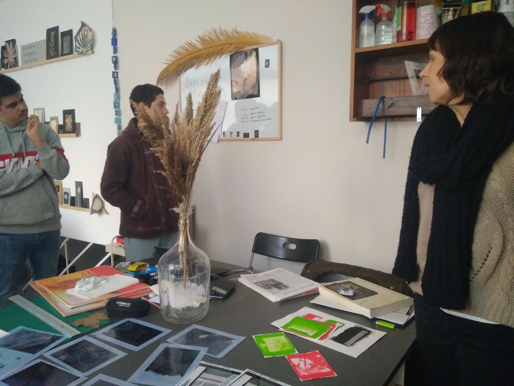
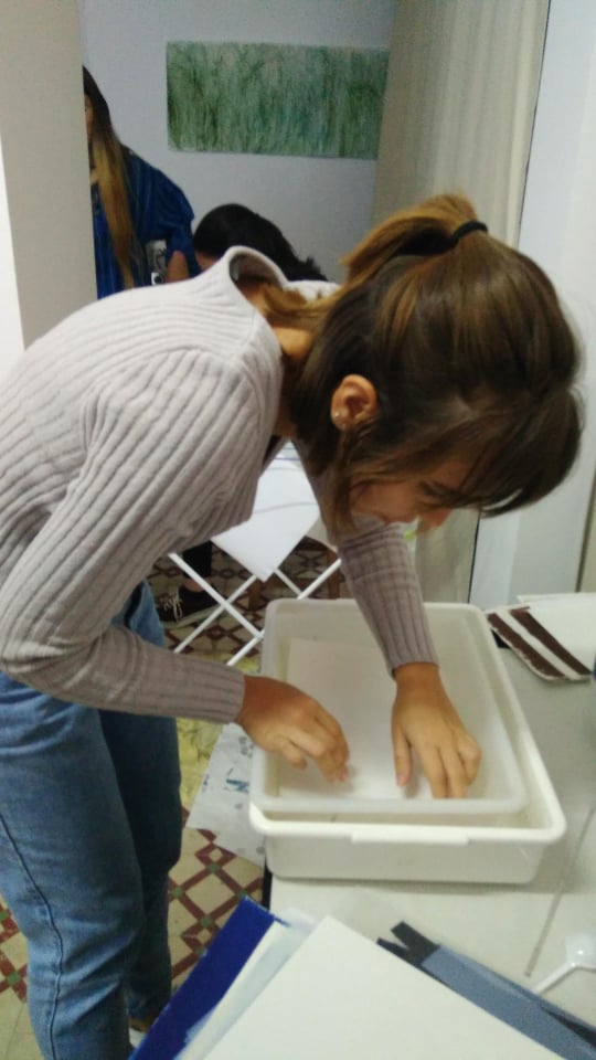
Image 1 – Get arounds we used to do in the begining of every class. On the right two colleagues of mine and on the right our teacher.
This one is based precisely in dichromate combined with gum. Gum being the original gum, not the resulted processes we commonly know.
So gum has it’s origin in trees, we could almost say that trees sweat gum, as they produce this kinda oily and thick substance that is not soluble in oils or alcool but that you can easely wash out with water. Gum Arabic is a mucilage that is the most common form of this, and was widely used ancient times as glue, as coating for ceramic and fabric and was and still is also used for this photographic process.
This process is done in layers in the majority of times, with watercolor (always in the same color). If you desire just one layer you can go with gouache.
The thing with the ink is that the gum itself has no color, so you mix it with the pigment and when exposed to light it hardens and so fixes the other element added. This is the reason why you can pretty much do it in any color you like (just not black, since it sticks to har in the areas were it is supposed to wash of).
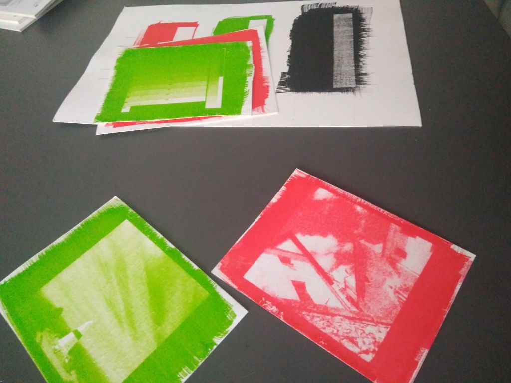
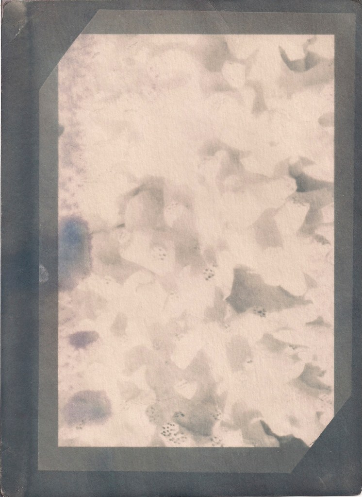
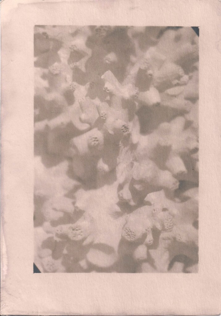
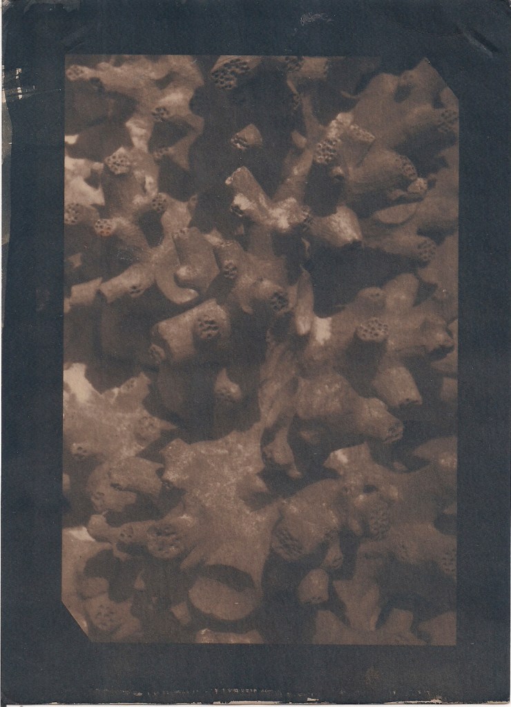
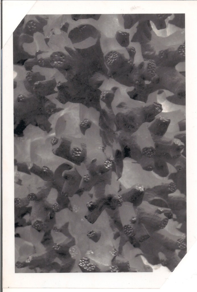
Image 2 – Color tests, and in the back you can see what happened to the black pigment once it stuck to the paper, it didn’t go back to being white.
Origin
So apparently, like almost everything in photography, a lot of people came up with the same conclusions and ideia that gave birth to this process.
Let’s just list them, shall we? I’m feeling impatient today
Loius- Nicolas Vauquelin (1763 – 1829) was a French chemist that in the lates 1700 documented the sensitivity of these materials to light, being the first to do so.
Mungo Ponton (1801 – 1880) a Scotish in 1839 discovered that dichromate salts were sensitive to ultraviolet light, and using sodium dichromate and a colloid acctually managed to print a photography!
Henry Fox Talbot (our old acquaintace) in 1854 also just documented during experiments that arabic gum and gelatin became unsoluble when exposed to light
John Pouncy (1818 – 1894) in 1858 started using color pigments (ink) to produce photographies.
Recipe time!
Ingredients:
Canson acrylic A3 paper 400gr (specifically because of the fibers and sizing of this paper, that allow it to spread ink evenly without blurs)
Guache
Brush
Tap water
Solution:
0,6gr pigment
0,4 ml Arabic Gum
0,5 L distilled water
0,32 ml ammonium dichromate (26%)
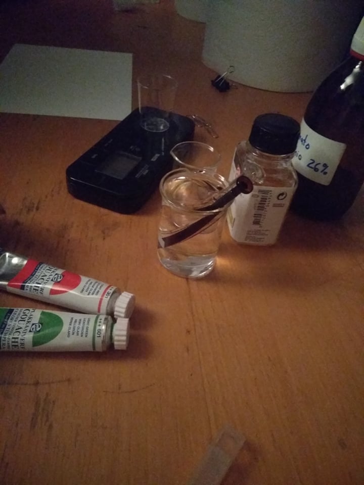
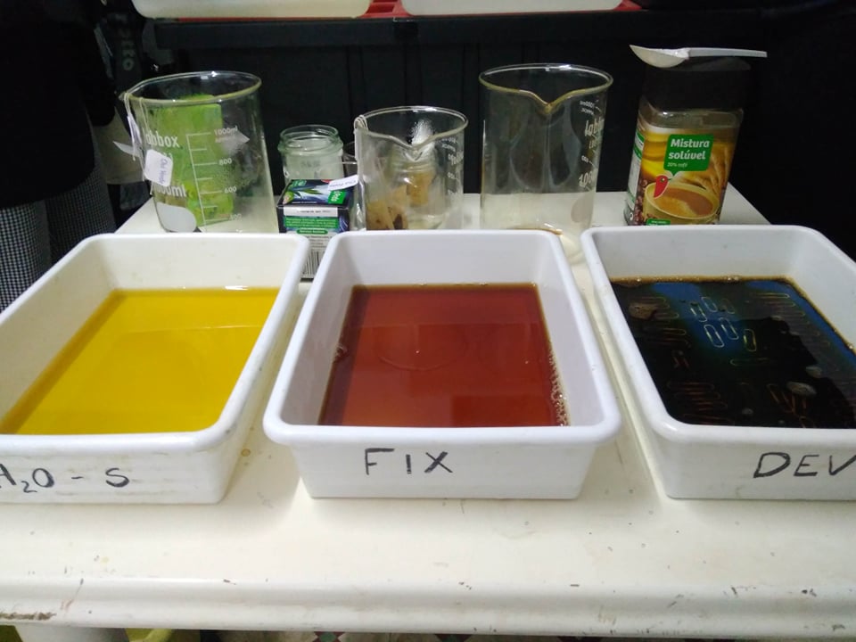
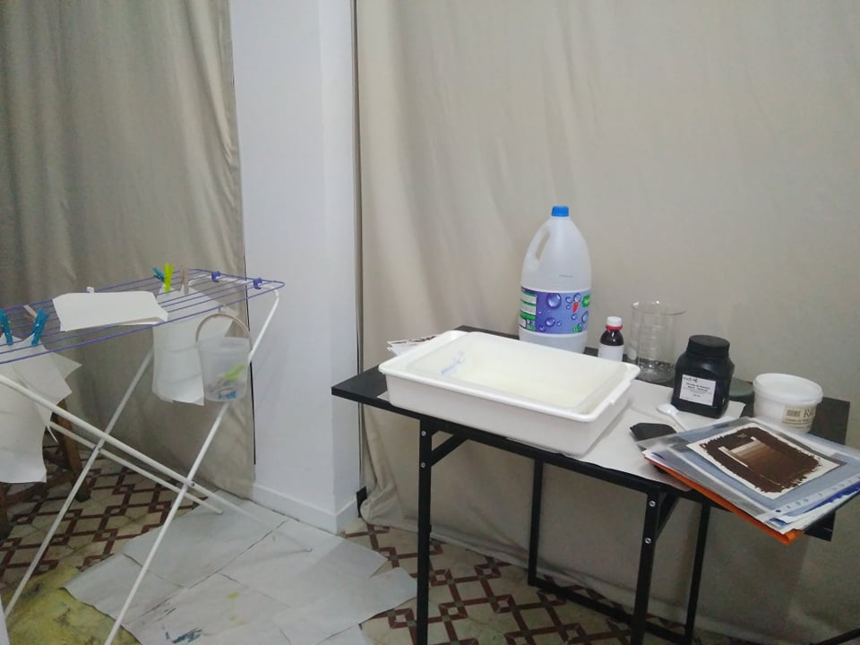
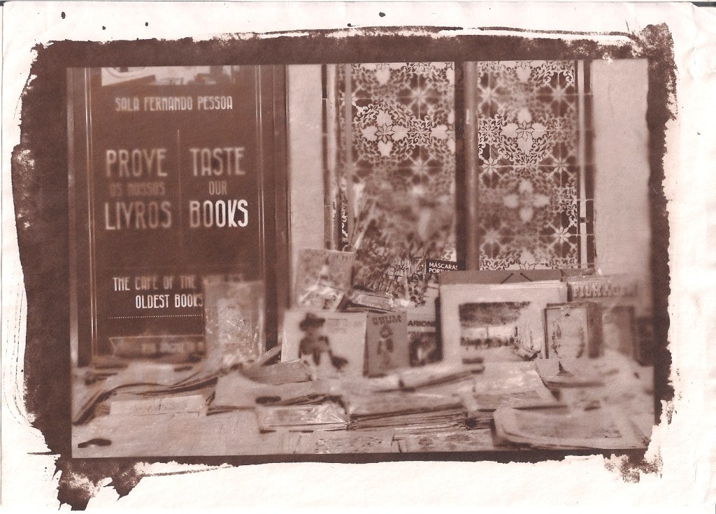
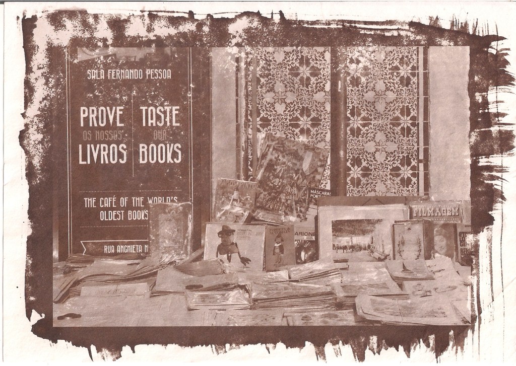
Image 3 – Our materials, to be fair for once and acctually showing them instead of just listing them
Recipe:
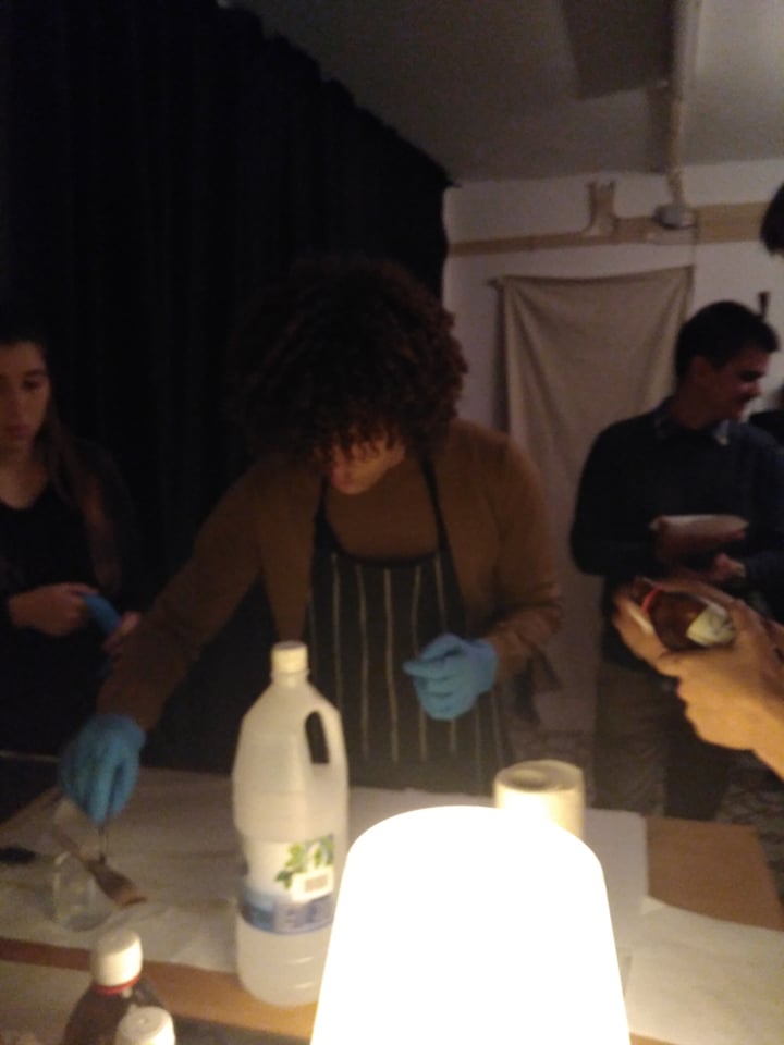
1stmix the ingredients for the solution in a glass recipient and stir it also with a glass object (use a candle for light)
2ndcut the canson paper into whatever size you like
3rd put the solution on a paper with the brush, softly not to leave marks and fast enough so the gum doesn’t start to dry out by itself (use a candle for light)
4th let it dry out a bit and then prepare your negative/object and your press
5th expose it to light for 4 minutes
6th take it out of the light and the press, and put in water
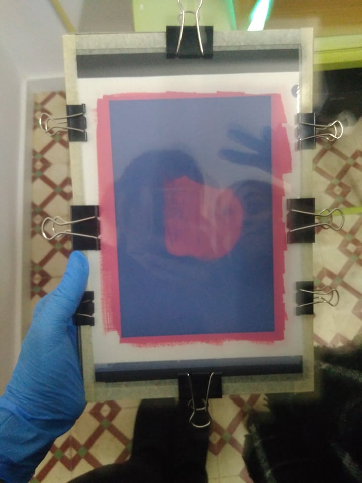
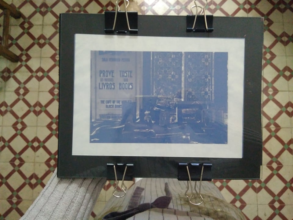
Image 4 – My press with my binders (a lot of them because i never made the same mistake as i did in salted paper again! If the negative is not tight together with your paper the lines will blurr) and also my and a colleagues reflection on the glass
I changed my water several times (being careful not to let the pressure of the water touch my paper), almost every 10 minutes for the first hour. And then let it stay in water for 24 hours, and then ran it under falling water so it woul speed up the process a bit.
And also keep in mind that when you take it out of the press you don’t see any image, don’t be frighten, it is there, under all that ink.
And vólia! The unexposed areas are gone and it looks like a paiting.
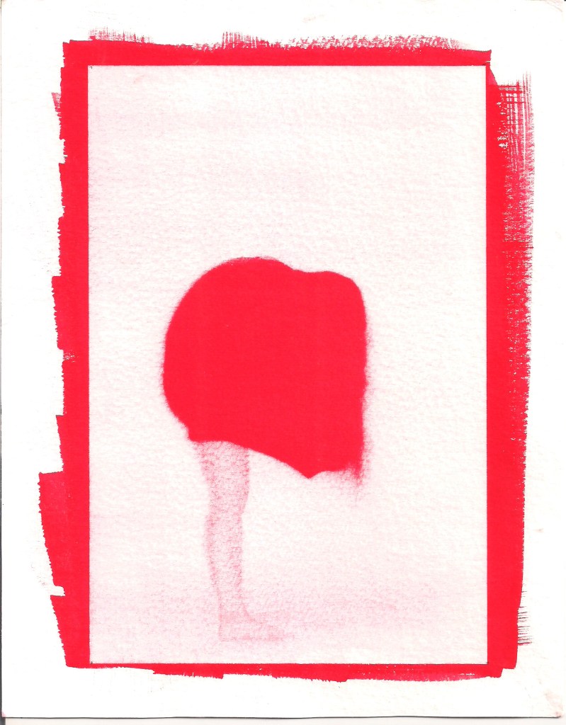
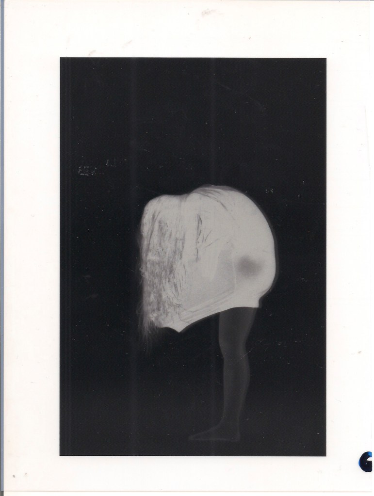
Image 5 – Final result of my first attempt with red gouache. I really like that. I like the contrast and the vivid color, also love the middle tones on the leg. And the lack of a lot of detail on the hair (because it was a dark shirt and dark hair) gives it a more twisted look that i enjoy very much.
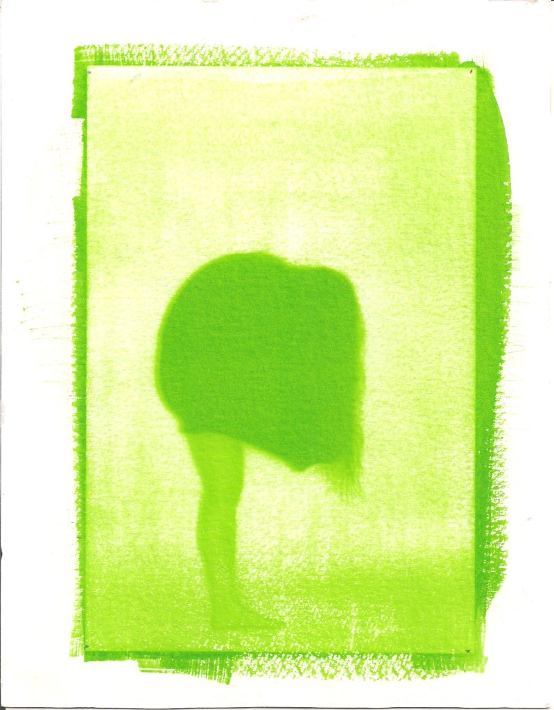
Image 6 – Second attempt with some leftover solution from a group of colleagues, i didn’t like the green at first but i have to admit i kind of enjoy this final result to. Although it is clear that green has more detail into it than red, wich i don’t like as much on the hair, it has a better effect on the leg…. So also a nice contrast and better middle tones.
Also it was fun to make because although i was the one that took this picture, the one that is in it is acctually my colleague (the one on the reflection on the last one) so they are now souvenirs for us!
I hope you enjoyed my “journal” of my classes. I had a lot of fun experimenting these and hope i can push someone else into doing so to.
Also hope i get better at this and get the chance to write some more (outside of classes of course, they are over now) about some other cool processes i heard about in here.
Wish me luck, beacuse i wish you to all the luck too in experimenting these! We all need it very badly!
This was one of my absolute favourites (wich is ironic since historicaly it was given less importancy). This one was the first not to use silver, it is also one of the simplest and cheapest ones I’ve ever heard of. Not even requiring the use of the usual revelatory chemicals.
It is also easily recognizable anywhere since it produces images in Prussian Blue, wich is a fun characteristic coming from the component used: Iron.
Let’s show and tell, shal we?
Materials:
Iron and Ammonium Citrate (20% concentration)
Potassium Ferricyanide (10% concentration)
Tap water
Hidrogen peroxide
Paper or fabric
So the specifics of this process come from the combination between the two first solutions metioned, which when combined turn into a green substance on the chosen surface that is really quite ugly, but once exposed to ultraviolet light turns into ferrous ammonium citrate and potassium ferricyanide, wich then forms iron ferricyanide, wich is what produces insoluble Prussian blue.
Image 1 – Color attempts and tests
When Prussian blue is formed, it is fixated on the paper and is not soluble in water, when on the other hand while it is just the chemichal (unexposed) it is. So it doesn’t need reveeling. All you need to do is put it in a box regular tap water and the unexposed areas will dissolve, and you have a beathiful Prussian blue clear image (also, soooo much cheaper and easier to do at home)
(I mentioned hydrogen peroxide before because it is a type of water that is cheap, you can buy in any convenience store and helps speed up the process of washing the green out of your image, you use it the same way has the regular water but the tiny bubbles it forms, mean that it is interacting with the none exposed iron and thus removing it faster)
So, cooking:
Mix the chemicals
But them on the surface chosen (with a brush, a spatula, whatever you would like to see)
Let it dry
Expose it (as a photogram or with a negative on top for a photographic image) in the sun light or any ultraviolet ligh
Take it of the press and put it inside a box of water while moving it around to make it faster
Put inside another box with hydrogen peroxide and watch the bubbles, once they stop, there is no more reaction and you can run it through water again (just a regular wash, you can even rub it)
Dry it out and that’s it!
Image 2 – My greenish paper with my negative inside the press
Wanna play some more? Or you just don’t like Prussian blue? We got you covered:
We called them: Turns (because they turn the colors into others)
The results vary but keep in mind that the possibilities, although many, result based on Prussian blue.
You can either whiten the image with a solution of sodium or ammonium carbonate
OR
Turn the colors a bit.
I can give you the ingredients I used, but it is easier and more exciting to say that anything that contains polyphenol, even if they are house items, like: green tea, black tea, coffee, wine, pomegranate and so on.
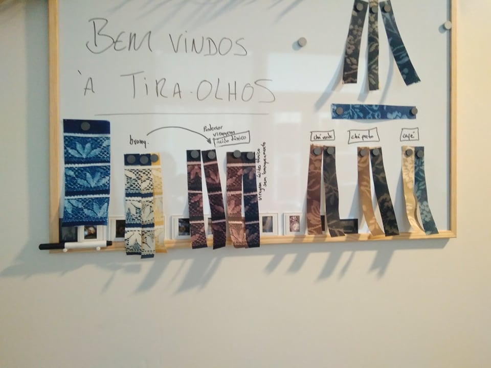
Image 3 – Turns possible with the materials we had (whitener, tannic acid, green tea, black tea and coffe, respectively)
Image 4 – The turning baths we used: green tea, black tea and coffee (the ID written in the boxes is wrong, of course)
The beauty in this is that you don’t need to go just one way, you can whiten an image and the put it in coffe, go back to tea, and then pomegranate juice after. There are no rules. Altough i strongly advise that if you are using the acid or the whitener, do them first and carefully, since they are more expensive, don’t risk mixing them with coffee.
Hystorical Origin
Call them: Cyanotypes, blueprint process, ferroprussiate prints or iron prints.
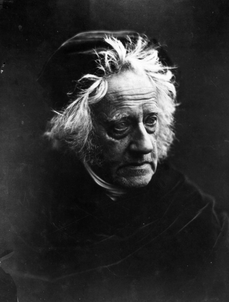
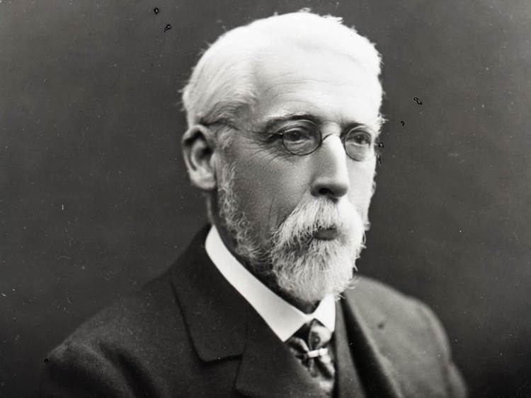
Image 5 – Sir John Herschel – English polymath, mathematician, astronomer, chemist, inventor and experimental photographer
The inventor of the process was John Herschel (1792-1871), who found that ferric citrate could provide a light sensitive layer. This was discovered by the need Herchel had to copy his astronomy notes faster. Although this discovery happened 3 years after the discovery of photography, the process was renegaded, since blue prints were not appreciated at that time, while black and white was still being perfected. Even so, Sir Herchel was also the one who gave us the words (and concepts) of: positive and negative image; photography and snapshot.
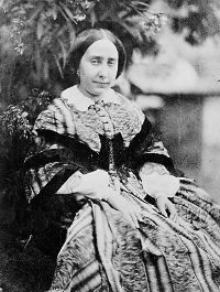
John George Children’s daughter: Anna. She was passionate about science and often helped her father in chemistry, mineralogy and zoology. After marrying John Atkins, a wealthy mearchant, she had pleanty of time and money to pursue her passion for botany. She learned cyanotype with Sir John Herschel himself, she was also close to Henry Fox Talbot, since her father was heighbor to them.
Image 6 – Anna Atkins – Science and Botany enthusiast, writer
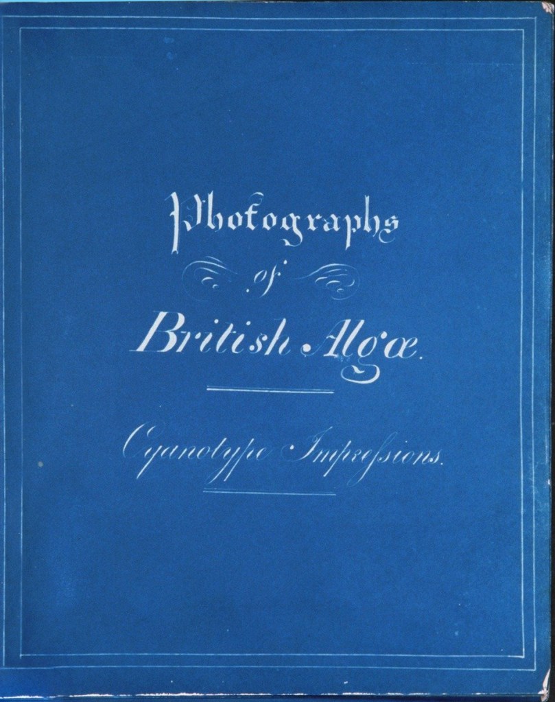
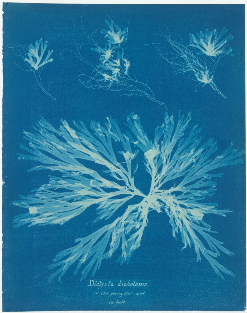
Anna Atkins (1799-1871) later produced and illustrated the book Photographs of British Algae: Cyanotype impressions (1843-1853) with this process as she felt that this one would better craw the detail in the algae she intended to show, also it was cheap and easier to fixate on paper. Each book was handmade. This was the first photographically illustrated book in history, it was also the one that made cyanotype famous.
Anna Atkins Photographs of British Algae: Cyanotype Impressions
My blue prints
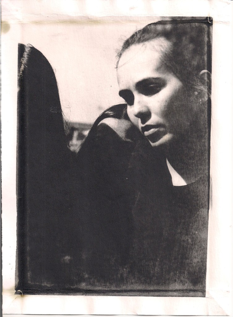
Image 7 – My Anna Atkins inspired blue print, in beauthiful prussian blue, washed with water. Nice contrast and detail in my opinion.
Image 8 – One of my first turnes, that turned into disaster. This image had a lot of white in it while it was still blue and i tried to whiten it for like 3 seconds and it almost faded. I put it in coffee afterwards to try and regain some dark areas. Really bad contrast of course, also bad detail, also a blurr in the left central side, and no detail at all.
Image 9 – On this one i used a frame (made out of card board) to only expose the image and not the borders. And then i turned it with tannic acid and green tea. I liked the pinkish look, although the details are really bad because the press was not properly held together when it went into the sun, and i lost a lot of contrast.
Image 10 – So this one had no frame, acid or whitener or what so ever. I just moved it around between coffee and black tea. Literally back and forwards. And i absolutely love this one, the contrast, the almost black frame, the detail, the white spots, the whole thing.
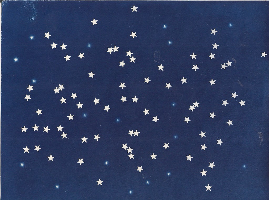
Image 11 – This was my playing with makeup from a colleague, so i just exposed a paper with the little cut stars under and over the glass in the press and it resulted in this. I loved it so much in blue that i didn’t want to turn it. And also, this contrast, perfect blue and perfect white.Image 11 – This fellow was made by yours truely in a moment of despair with life, by scribbling with a green pen on a piece of acetate paper (it was the teachers idea, not mine) and then putting it in a press exposing with a bunch of random pieces of plastic i found laying around (whiter areas in the top left and lower right corners)
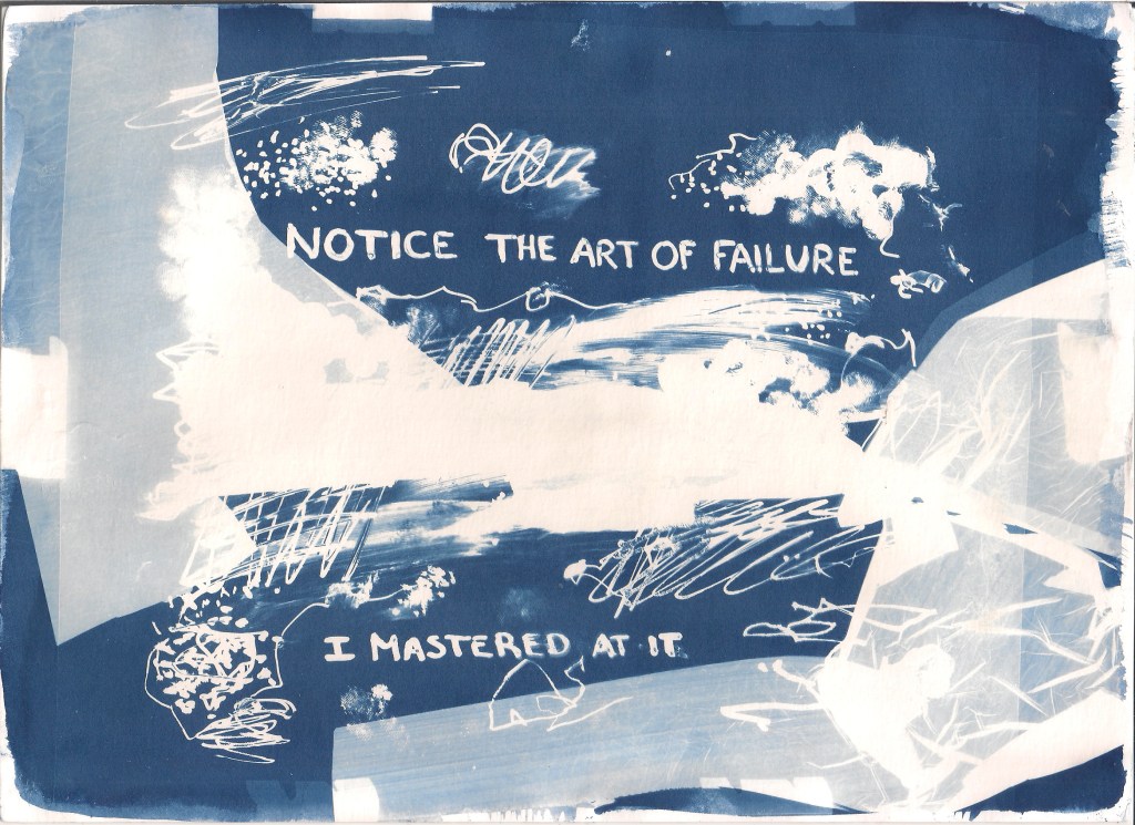
I have to confess i was having a hard day on this one. Everyting in the previous classes was going wrong, my personal life was an abomination (had none and people were getting mad at me for it), my job that pays my tuition was consuming me and i saw very clearly that i was not going to be able to balance everything. Also i keept seeing some injustices and unfair people hurting some others. So the whole thing resulted with be just being angry at the world, snapping with everyone and just giving up on doing everything.
The teacher did not allow that, thankfully. She pushed me into getting so distracted that as you can see i ended up doing a lot of pretty things. I feelt this was a very therapeutic class.
Also she gave me a passage of a photography book to read, that acctually made me laugh:
“Notes on the art of failure”
As the story goes, William Henry Fox Talbot sought to invent Photography because he couldn’t draw. Having failed at making a decent landscape using a camera lucida, he wished to get Nature to “paint itself”. Through years of trial and error, Talbot managed to produce some of the first lasting photographic images only to have his singular break-through trumped by the superior work of a better founded Frenchman. As more and more photo-Photographers began to stake their own claims, Talbot raced to show his earlier discoveries, but was thwarted by minor missteps and a summer of bad English weather. He barely eked out some flawed and faded photographs in time. Nevertheless, this was the birth of the Art.
If Photography was born from failure, then surely it must have always carried failure in its genes. Even as it laid claim to representing nature more perfectly than ever before, many of its earliest critics noted the odd and empty world despicted by the camera, or the deathly pallor and embalmed stare of its once-living subjects. As the technology grew faster, better and more detailed, the technological advances of Photography were matched by even greater critical and philosophical concerns over its connections (or lack thereof) to Truth and Reality, and it’s further politial uses in the world. The sharper the image, the more its meaning, as if it were simply getting better at hiding the magician’s sleight-of-hand under a pretense of objectivity.
Since we opened a door through salted paper to gellow and silver to be allowed in, we will continue with this kind of work.
This was thrilling. With this process we can print pictures in almost any kind of material. I don’t mean any kind of paper, I mean material! Glass, wood, stone, paper, plastic, fabric, you name it.
Let’s continue with our recipes, shall we?
Possible ingredients used in these emulsions:
Watery veichle – Water and gelatine, were the cristals will be scattered
Silver Halide – Silver bromide, silver iodide or silver chloride
Anti veil – potassium bromide, wich pretty much avoids the development of a white “veil” on the image’s surface
Anti fungus – Fenol
Sensitizer agents – Active gelatine, gold salts, fixator in small amouts or dye. These will incfease the sensitivity to light.
Hardening agents – Like formalin or chromium salts, they reduce the gelatin’s capacity to absorve water, this way, preventing it from slipping out of the material chosen (like it happened to me, but we will get there)
Plasticizer – these facilitate application of the emulsion in the surfaces chosen
How to “cook” liquid emulsion:
1st – Precipitation – When through precipitation insoluble cristals are formed
2nd – Maturation – the growth of the insolubl cristals takes place
3rd – Washing – Pretty much just washing the excess of cristals
4th – Post Maturation – The adding of gelatine, sensitizers and dyes (just like it is described in the ingredients)
But what happens, that turns gelatin into a light sensitive material you might ask?
At its heart silver gelatin photography is a kind of alchemy: light and chemistry are used to reduce light sensitive silver salts suspended in a gelatin emulsion into pure silver. During the manufacturing process ions of silver bonded to atoms of the halogen family (usually bromine, chlorine, iodine) form crystals of water insoluble silver salts, known as silver halides. These are suspended uniformly in a flexible gelatin emulsion which is coated on a transparent base. Unlike their photographic predecessors, these crystals are shelf stable for long periods of time.
Once exposed to light the crystals absorbs the energy of photons. This energy causes atoms of metallic silver to build up flaws in the crystal. The more photons absorbed by the crystal the denser the cluster of silver atoms grows, forming a latent image, once enough silver has formed on the surface of the crystal it becomes something that you can develop.
Before we move on, you might ask is who the heck thought of ever using gelatin to fix photographs?
Image 1 – Richard Maddox
Well, that was Richard Leach Maddox. He was the first to invent a relatively stable silver gelatin and patent it (yes, someone had the same idea first and forgot to claim it in time). This emulsion could be coated on glass, so that photographers didn’t have to make their own light sensitive materials, and could be marketed, wich was brilliant.
Maddox’s need for inspiration came from becoming sick from the fumes produced by the mixing of the emulsion for wet collodion plates, that also had to be prepared and placed on glass immediately before exposure (if the emulsion turned hard or dry you would have to start over again).
Of course Maddox’s technique was only perfected to the point that it was sensitive enough for short exposures. Later coming out as negatives, that could be commercialized in a relatively cheap way, and so lauching photography as an art form anyone could do.
My take on emulsion
The process I used in class was supposed to be simple: we used commercial liquid emulsion and a surface of our own choosing. I chose glass (heads up, biggest mistake of my life).
We started preparing our materials for the emulsion. Those who had stone for example had to put a coating on it, glass had to be treated so it would have micro abrasions (we basically scratched it in circular movements using alcool, water and calcium carbonate dust), but the right fabrics or papers don’t require this prep has they already have fibers to wich the emulsion can grab itself on.
The place was equipped with red lighting, as the others expose constantly.
The emulsion has to be warm so it turns liquid, but we can’t just heat it directly because it will affect it’s components, loosing their sensitivity. So, in Portugal we call it “Banho-Maria” here let’s just say, contact heating. So you fill a tank with hot water and another tank with the commercial gelatin (do not use a metal spoon to take it of the jar, use glass or plastic has metal will interact with the silver), and then put the tank with the gelatin inside the one with the hot water. Evaluate it’s temperature until it’s between 35ºC-45ºC.
We all did the paper (Canson A3 cutted in smaller bits), because it is easyer to test on it the exposure time. To sensitize paper we folded it into little boats: folding each side in about 2-3 cm, and then the corners to the inside.
Now all that’s left to do is poor the emulsion in the surfaces, levelling those suefaces so the emulsion would be distributed equally. Run down the excess of emulsion back to the warming jar and save it in the fridge (so it goes hard again and doesn’t loose it’s proprieties).
Put dow the paper, glass, wood piece or whatever your using in a levelled surface and let it dry out in the dark. The emulsion will loose water and loose that relief you see, and then it will be ready to go into the light and expose.
The best and easiest kind of negative to use in this process is analog film, I used one I shot for another class, and put it in the amplifier.
Took the paper and ran some tests. So I put the paper under the amplifier and covered it with a black card, leaving only a stripe out and turned the amplifier on for 3 seconds, moved it a bit more to expose even more of the paper and did it again 3 secs more and so on, so on until the other edge of the image.
So I chose to expose my final image for the seconds correspondent to the layer that seemed to me had the best details. This is what I came up with.
I achieved nice contrast on the left side of the image, my face ‘though is lacking liquid emulsion, all the way to the bottom of the image to. And overall, this might not have been the best image choice i did so far… Sorry…
Image 3 – My image correctly exposed on paper. Poor choice of image, i know. I’m the one in the sun, and my two colleagues on the left were in half shade, so it didn’t quite turned out as i expected.
After exposing the glass (my own choice to use glass) it goes into the usual chemicals:
Developer – 30-90 seconds
Stopping bath – 30 seconds
Fixer – 10 minutes
Whashing – 30 minutes (changing the water regularly)
Sounds easy han? Well forget it.
For some reason that evades me completely, as soon as they where put inside the chemicals, the image started to peel off. It didn’t stick to the glass, it started floting around in the revealer (contaminating it for everyone else using it) and even if it didn’t completely peel of and by a miracle we would stay still holding the glass in the chemicals, it was peeling off some places else and the image would move around. So by the end of this, not only was it destroyed but also the corner of my image turned yeallowish, apparently form the excess of emulsion.
So in a bigger picture, glass was a total disaster (every other materials turned out fine). The image I chose may not also have been ther best idea (since my face was in the sun, colleague was in complete shade and a middle colleague was half/half. So to have a correct exposure, was barely impossible and the final result was, we only get the middle colleague and a bit of my chin. This part was my bad.
Image 4 – Delight yourself in my disaster. The image on the back might look ok on this picture, and doesn’t have the yellow part but is also peealed of.
Still the teacher allowed me to print my image in emulsion on paper (since she noticed how low the moral around the lab was) and I managed to screw it up to, because my image was bad quality and I also put to much emulsion on the paper, so it turned yellow to. Disaster.
Some sources of information about liquid emulsions that are better at this than me:
Martin Reed and Sarah Jones wrote: Silver Gelatin – A users guide to liquid photographic emulsions
We start almost chronologicaly. Salted paper is the begining of photographic printing.
Henry Fox Talbot’s photogenic drawings
In it’s origin we cannot forget about Henry Fox Talbot that used this process in his photogenic drawings. So let’s take a stroll into the past, shall we?
Fox-Talbot is said to have begun his research into light sensitive paper because of his inability to draw, even with the help of a camera lucida and camera obscura.
“How charming it would be if it were possible to cause these natural images to imprint themselves durably, and remain fixed upon the paper.”
“And why should it not be possible?”
Henry Fox-Talbot
In January 1834, Talbot was home at about eighty-five miles west of London. He began to experiment with the idea and soon found that a sheet of fine writing paper, coated with salt and brushed with a solution of silver nitrate, darkened in the sun, and that a second coating of salt impeded further darkening or fading. Talbot used this discovery to make precise tracings of botanical specimens: he set a pressed leaf or plant on a piece of sensitized paper, covered it with a sheet of glass, and set it in the sun. Wherever the light struck, the paper darkened, but wherever the plant blocked the light, it remained white. He called his new discovery “the art of photogenic drawing.”
As his chemistry improved, Talbot returned to his original idea of photographic images made in a camera. During the “brilliant summer of 1835,” he took full advantage of the unusually abundant sunshine and placed pieces of silver iodided drawing paper in miniature cameras— “mouse traps,” his wife called them—set around the grounds to record the silhouette of Lacock Abbey’s animated roofline and trees.
(If you like history I strongly advise reading Malcom Daniel’s version, read it on the MetMuseum website linked below, written in October 2004, I fell in love with the story there, and it is quite a short version)
My photogenic drawing
The paper used int his process was thick enough to sustain the chemicals but not very white, for one very important reason: Usually paper who are truly white have whiteners like ammonia who will interfere with the chemicals used, ruining your master piece.
Image 1 – Our spot, on the right there are the chemicals used an the two recipients (the bottom one to warm up the water and the top one with the salted solution) and also a color test for a salt print (the brown image on top of the table); on the left we had our tenter to dry out the salted papers.
The first fase of the process was literally, salting. So we added 8gr of gelatine slowly and while agitating it into 1000 ml of destiled water. And let it rest for 10-15 minutes so it swallows. Meanwhile preparing 20 mg of Amonia Clorite (wich will give a darker brown tone to the final image but will also accelerate the exposure time, making it faster) and 10g of Sodium Citrate (Sodium=salt).
After the gellow is ready and dissolved, we had the Amonia Clorite and Sodium Citrate so they can impregnate the gellow and put the whole container in a warm water bath. Don’t ever try to speed this up by directly warming this in fire, itt will warm up to fast, ruin the gelatine that should be keept between 35-45º C. The gellow should be liquid at this point, so you can use it on your paper.
Putting the paper inside the gellow is also not so easy as you might think.
First: We have to know what side will have the salt after it’s dry so we mark it.
Second: the paper has to float and we can’t have bubbles in the right side or solution on the wrong one.
So, this is how we did it: Folded two corners of the paper in a specific way (to mark it and make it easier to grab) and put it in the water, first the middle and then the edges, to drag any bubbles in the gellow surface to the corners. Slowly of course, and just getting one of the sides wet.
Image 2 – This is me trying not to screw up my paper while salting it.
Then we dried the papers avoiding putting it in contact with anything else, so we don’t screw the gelatine surface. Turned the paper around once while drying to have a uniformed surface and then speed up the drying with a hair dryer.
The second part of the process will transform the salted surface ultraviolet light sensitive. So we had to do this part in a dark lab under yellow light and no humidity (because this last one will grab to the paper and gellow and ruin the image, giving it a look as if you litteraly dropped water on top of it).
We used a non metal (non metal=wood) pencil so it wouldn’t react with the silver (wich is also a metal). And spread Silver Nitrate at 12% concentration (between 1,5-2ml is a generous amount) around the paper carefully and in an homogenic way. We let it dry again and again, used hair dryer to give it a final blow.
Image 3 – This is Hugo carefully putting the silver on his paper under low yellow light conditions
Image 4 – Us, for fun, while waiting for everything to dry and be ready
Once you are sure it is completely dry put it in between foam, glass and hold it with binders, just like a lumen and just add the negative to the sandwich (with the printed/inked/darker part facing the emulsion on the paper) and we exposed it during 20 minutes in a light box with ultraviolet light.
Image 5 – My sandwich of paper, foam and negative, ready to go in the oven.
And Voilá! You have an image. Now, don’t let it fade away.
We go back to the lab and put it in the respective chemicals:
Tap Water (to wash off the excessive silver nitrate that is not needed nor exposed, during 10 minutes and changing the water regularly and not running it on top of the image, it is very sensitive);
Fixer (to finish what water started in a permanent way, removing the silver cristals that were not exposed to light from the paper, this way, the white will remain white, because in that area there will be no more cristals, just paper. Do it for about 4 minutes) + 2/3g of Sodium Carbonate to stabilize the pH;
Tap water again (to wash off the fixator);
Sodium Sulfite (to make sure there is no fixator left, for about 5 minutes);
And just a final wash with tap water for 30 minutes and switching water every 5 minutes.
And now your image is not going anywhere.
So, I’m impatient, right? I managed to screw up my salted paper print. Apparently I didn’t press the negative well enough against the paper, so it seems out of focus, or diluted. And you can see the difference in my image, the first one, a test the teacher used as an exemple in class and mine next to it. Shame on me. Still, it was fun and I enjoyed the picture I choose in this specific process, it has that old, very vintage look. I’ll just have to embrace the blurr. Despite this, I did achieve the contrast I wanted and I like my brushmarks around the image, so it was a shame to ruin it.
Also, embraced the brown stains in my hands that wouldn’t come of for days, because I touched the chemicals without putting gloves on. Don’t be like me, use nitrile disposable gloves when you touch chemicals.
Image 6 – My go on the salted paper, with the reffered blurr.Image 7 – The teachers half go on the saltedpaper (Half because the image wasn’t fixated, or properly washed, as it was supposed to be an example, so you see some lost color but have a defined image, unlike mine).
This class was not exciting but it was quite necessary. So pretty much we just learned how to digitally produce negatives to be able to print images (not only using film negatives, wich come out of the camera already produced, but using images from digital cameras, that go straight into a computer). This way i can print images i already had and loved!
This is made with specific paper (Pictorico Pro) and with a printer with ink jet (NOT LASER, you don’t want to melt it). But then we prepare each image chosen to a different process using different curves settings. This because not all processes are the same amplitude density (i mean, the difference between the most transparent and most dense part of the negative and also the way that the tones are distributed) or have the same ability to reproduce detail, hence the need for a specific curve. So we are trying to get the best out of every image.
First: LAYER – NEW AJUSTMENT LAYER – CHANNEL MIXER – here turn the image into monochrome and work with the channels adjusting tones. Keeping the light in the image close to the number 100 in the bottom, so you have the same luminosity in the image, despite changing the colors.
Second: LEVELS (adjust levels in high light and low light in the histogram showed. If having any doubts press the tab in the corner and press ALT at the same time, even if you move the mark around, you will see the areas in your image that are loosing info or not. And Try to keep the whole image with digital information, so you have a lot to work on)
Third: CURVES (just ajust the image to your liking)
Fourth: Select the image and not a layer – FILTER – SHARPEN – UNSHARP MASK (and move the itens around so you can see how they work and how you want the detail in your image)
Fifth: Go up to your last layer again and create a new CURVES layer. This time, load in the corner the curve preset to the specific process your using, in LOAD CURVES PRESET (these presets can be found online, although our teacher gave us the ones we used)
Once all of this is done, all we have left to do is invert the image into a negative and mirror it horizontaly so it is in the exact position we are going to use it.
Invert: CTRL + I or IMAGE – ADJUSTMENTS – INVERT or LAYER – NEW ADJUSTMENT LAYER – INVERT (this will make the black go white and vice versa, this way, when you use the negative, the area that is supposed to be black, happens when it is touched by light, so the negative part of that image is white, to let the light go through)
Mirroring: IMAGE – IMAGE ROTATION – FLIP CANVAS HORIZONTALY (beacause otherwise when printing in the photographic paper the image you took will be the other way around, weird right? Well, that’s how light works)
That was all, just practiced this a bunch of times until I got it right. And now I am just very curious to see how my pretty images will turn out after printing.
Image 1 – Negative prepared for salted paper
Image 2 – Negative prepared for cyanotype
Image 3 – Negative prepared for one layered gum with two different pigments
The day came to do our first experiences. So the class was divided in two groups so we could work at the same time without to much of a mess. So half did photograms (inside the lab, just because we had one available, it’s not mandatory) and half lumens (outside, in the sun).
Let’s start by defining what this is, shall we?
Photograms ar photographies as we know them, only they are made without a camera and the colors are reversed (what had light on turns black, what doesn’t stays white) so they are almost like a shadow of what was placed on top of the paper. Photograms are presente since the begining of photographies history, and were givem many diferente names by each one of the people that tried, rediscovered or used them. Beacause, as i recall from my last post, it is impossible to give credit to jus tone person for this process.
The history of photography is punctuated by practitioners who have developed a technique or style that has become a part of art history. The first period of “photogram” exploration was to gain scientific record of natural objects (e.g. Anna Atkins). The second period was a rediscovery of the artistic potential as illustrated by Christian Schad, Man Ray and Lazlo Moholy-Nagy in the Dada, Surrealist and Constructivist periods of art, respectively.
Wedgwood called them light profiles.
Fox-Talbot called them photogenic drawings.
Niépce called them heliographism.
Man Ray called them rayograms.
Although i have to admit to have Man Ray’s rayographs has an all time favourite.
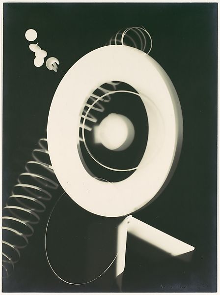
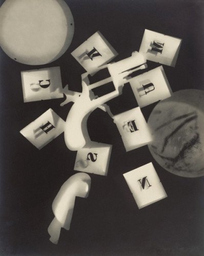
Man Ray made his “rayographs” without a camera by placing objects-such as the thumbtacks, coil of wire, and other circular forms used here-directly on a sheet of photosensitized paper and exposing it to light. Man Ray had photographed everyday objects before, but these unique, visionary images immediately put the photographer on par with the avant-garde painters of the day. Hovering between the abstract and the representational, the rayographs revealed a new way of seeing that delighted the Dadaist poets who championed his work, and that pointed the way to the dreamlike visions of the Surrealist writers and painters who followed.
Image 1 – One of Man Ray’s many rayographs.
My photograms
I will post this as if it was a recipe for food, because it helps me explain it and also i think it will help me understand it when the time comes to repeat the experience.
Now, first recipe:
Source of controled light (we used photography amplifiers beacuse they have timers included, but a regular lamp and a chronometer will do just fine, it’s not an exact art)
Photosensitive paper (Ilford worked just fine)
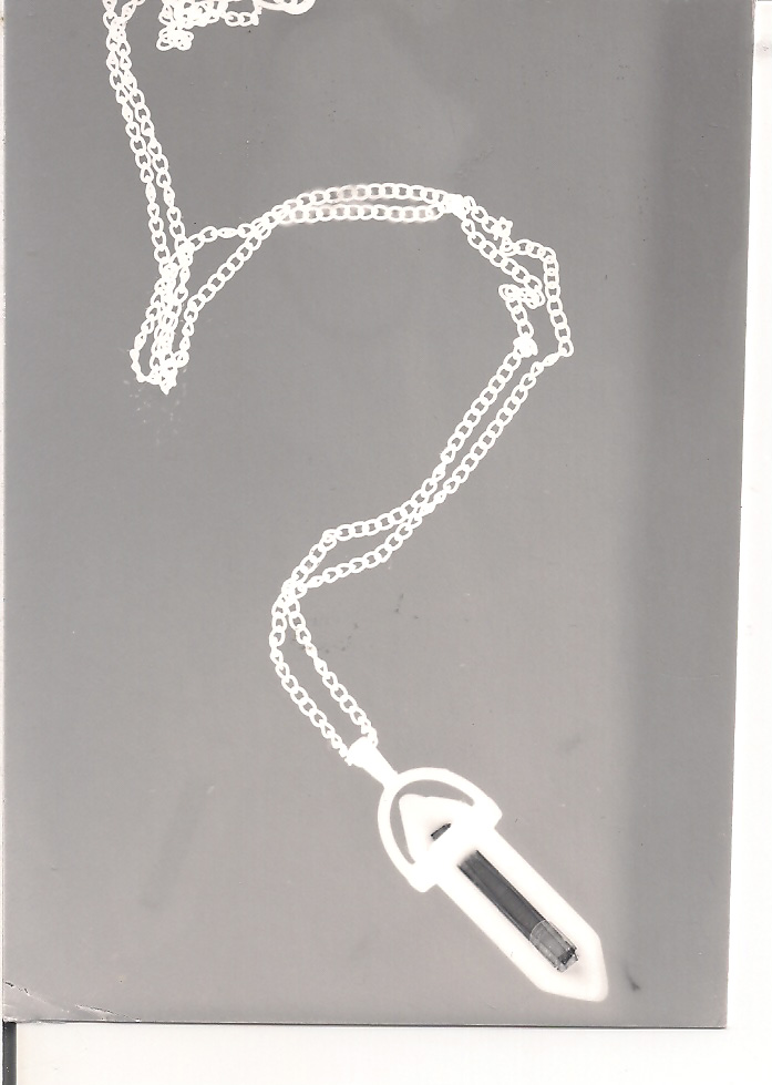
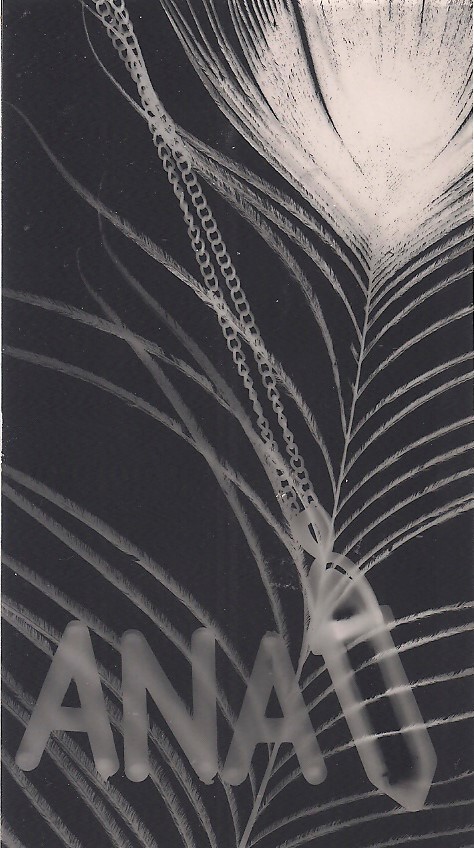
Objects (this time bi or tridimentional, because ther is no need to flaten them, so i had a necklace and some plastic letters, and yes, i stole the idea from some of Man Ray’s photograms)
Usual chemicals (developer, stoping bath, fixer and tap water)
Preparation:
Pretty much just adding the right amount of water to each chemical (following the manufacturer’s instructions) and putting them in order and separate containers.)
Process:
You can do photograms in basically any kind of light sensitive paper. We used silver ones (they turn into black when exposed). You place the paper in a surface and the objects on top of if. Place the light above them and figure out how much time you want to expose it, just through several small attempts. Keep in mind that transparent objects will require less light to go through and more dense ones will require a lot more time. But it is a quite experimental process, and a lot of fun to just do a bunch of small tests, and prepare yourself (or your timer) to countdown!
Count the SECONDS and turn of the light. You don’t see any image yet, normal. Grab that pape rand put it insider de developer container, and gently move the container around to cover the whole paper surface equally. After some time the image will start to show. After 2 minutes, move the paper into the stop bath (wich alters the pH and stops the developing process) for 30 seconds. Finally do the same thing but in the fixer, wich will remove the unexposed (silver in this case) cristals, thus making your image permanent.
The whole process is quite fascinating and it really helps us to understand where photography is coming from.
So, when i tis exposed to ligh, the silver cristals in the surface of the paper will get tiny craks, then the strong reducer present in the developer reduces the silver to the metalic state. The afterwards bath is the stopping bath, wich basically inhibits the reducer action in the surface so the revalation stops before we move to the fixating bath wich fixates the image by dragging and removing the remaining cristals that were still waiting to be used. This way the cristals that “saw” light turned darker and the ones that did not,were removed, and the paper stays as white as it was when manufactured. The ones that were not craked, did not combine with the revelatory chemical and were later washed out by the fixator.
I absolutely loved this class. The process, although simple, was my first ever contact with the chemicals and photography labs. It helped me understand how the chemicals work, and seeing the image being born was magical.
I just took the opportunity to have fun and experiment a lot with different materials, with different timings in the light and different densities. I cut some larger papers into tiny pieces so I could do smaller, but more experiences.
One of the ones I love the most is one that I (stupidly) exposed the paper in the worng side. So, when I placed the paper inside de revelator, it did nothing, it wasn’t exposed. Instead of throwing it away I took it out, shook it and placed it under light again (still soaked in chemical, and yes, I know how stupid it sounds) and then proceeded in the usual way. And my mistake turned out beautiful (just like Man Ray’s Portrait of Marquise Luisa Casati in 1922, caused by a bad tripod that fell of in the decisive moment, giving her 4 eyes). But in this case beacause instead of black, it turned into a beautiful shade of grey and strong white, looking like a strange x-ray.
Image 2 – My beautiful mistake (wrongly exposed image for 4 seconds with 5,6 aperture in the amplifier, revealed and then exposed right again for 4 seconds, afterwards revealed, and fixed). The cut in the paper is not even because it was a spare paper someone cut and forgot around the lab and i just felt like i should use it.Image 3 – A properly done photogram, using plastic letters that i brought from home, 3,5 seconds of light was enough here). It looks kind of dirty but it was acctually the scanner, the original is perfect.Image 4 – experiment with materials that have different densities, feather, metal an glass necklace and plastic. This one i did under 4,5 seconds of light, and it is a really small piece of paper.
I always loved the black and white colors, so it would be hard for me to not like these. The contrast was better acomplished in the last two images of course, and I assumed these timings in the light were proper has i could see through the different densities materials and still have perfect white, and perfect black in the same image. Of course the paper also behaved beauthifully (it was a comercial grade) and it was matte wich brings out the dark tones.
So we started this shcool unit with it’s logical birth, history.
But alow me to begin with a conclusion: Photography doesn’t have just one story but serveral that converged, although their starting point had it’s origin in mutiple country with distinct influences.
“But someone has to have been the first, someone had to beat someone else to it”. Well, oppinions diverge on this matter. But let’s all agree that photography needs 3 things, and only these 3 to exist:
Light
Object
Photosensitive material
So, since that light and
objects exist since the dawn of time. We can say that photography started by him
who created photosensitive material to print on, thus recording what we see has
it is, and not the first camera holder has you would think.
This is why the
history of photograpy always shifted between assuming the documental value of
images, as a way to just record reality and the way in wich diferente ages put
their artistic toe into it, throughout the experience of creating something.
Having said this, there were countless experimental attempts to find photosensitive materials to produce what were originally called “photogenic drawings” meaning drawing created by light. These attempts pre-dated the existance of cameras and pretty much worked by: coating commonly available materials such as glass, metal, paper and even leather with light-sensitive chemicals.
The first chemically
photographic process can be considered a photogram.
Important names in the history of printing
Johann Heinrich Schulze (1687-1744) – German physicist and professor of anatomy and medicin, found that silver nitrate in a jar, when left exposed to sunlight, turned dark on the side facing the window. After exposure, if the bottle was shaken, fresh silver nitrate replaced the exposed material near the glass surface. Schultze first demonstrated that this action was caused by light and not by heat. Schultze’s experiment failed to result in a permanent image because exposure to light continued to change the unfixed silver.
Thomas Wedgewood (1771-1805) – Chemist, physicist and son of the potter and industrialist, Josiah Wedgewood. By experimenting with chemicals in his father’s shop was able to produce only temporary images. He is known to have produced designs on leather, glass and ceramic items. Wedgewood called these images “sun prints” a term that has survived until today. His work also failed to produce permanent images due to his inability to fix the image.
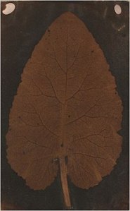
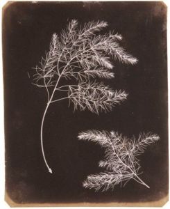
Salted paper photogram of a leaf, circa 1839. A speculative attribution to Wedgwood in 2008 was later retired. Although this is a controversial matter, it is one of the first photograms in history.
“No attempts have been made to prevent the uncolored parts of the copy or profile from being acted upon by light have yet been successful”
Thomas Wedgewood
“The copying of a painting, or the profile, immediately after being taken, must be kept in an obscure place. It may indeed be examined in the shade, but, in this case, the exposure should be only for a few minutes, by the action of candles or lamps, as commonly employed it is not sensibly affected.”
Humphrey Davy
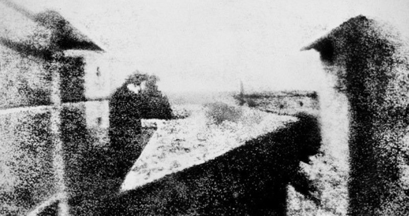
Joseph Nicephere Niepce, in France, in 1824 created a recorded image of a drawing by coating a sheet with Bitumen of Judea, a type of asphalt. By exposing through the drawing, and washing off the soft unexposed asphalt resulted in a photogram copy of the drawing. Niepce continued to explore ways to improve his process without significant success. He abandoned the concept and experiments and later worked with Louis Jaques Mande Deguerre on the Daguerreotype process.
Joseph Niepce – Point de vue du Gras, 1826/1827 The photography took 8 hours of exposure to sunlight.
William Henry Fox Talbot (1800-1877) – English scientist and mathematician, while traveling in Italy in the early 1830’s used a camera lucida (a portable camera obscura) to draw nature and because of the difficulties in detailing various subjects, he decided to investigate the use of photography as a way to capture the details.
Talbot began investigating
the properties of silver salts in mid-1834 and in 1835 and part of the process
was to expose to sunlight until an image appeared, followed by washing the
print in salt solution under low level of light, resulting in a relatively
permanent image.
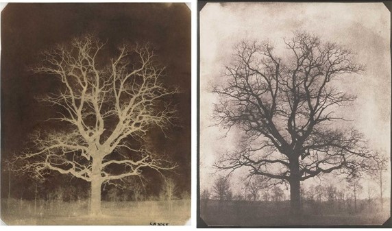
Fox Talbot – Aspargus Foliage, 1840’s
Talbot used the term
Calotype from the Greek “calos” meaning beautiful” to describe these images. Talbot
was the first person to expose sensitized paper in a camera. Since film was
unknown at the time, Talbot oiled the paper to make it transparent and this
“negative” was used to produce a positive by contact printing through
the oiled paper. Talbot is considered the first person to create a photographic
process that produced a negative that could be converted into a positive image.
William Fox Talbot – An oak tree in winter, 1842-1843
He was also the first to manage to fix his photograms, in the salted paper, so his photogram images were the first to survive to this day.
We also owe a great deal to Anna Atkins (1799-1871). Anna, was born in Kent and spent her childhood in the presence of many of the leading English chemists. She helped her father in scientific endeavors. Also, Herschel and Talbot were friends of Anna’s father and thus Anna knew early on about the cyanotype and Talbot processes for creating images. Anna later used the process of making cyanotypes to produce detailed images of botanical specimens, he then used these to illustrate her book entitled “British Algae: Cyanotype Impressions”. This was the first book that was illustrated using photography.
Anna Atkins – Cyanotype: Dictyola Dicholoma, 1843. Printed and published Part I of “British Algae: Cyanotype Impressions” in 1843 and in doing so established photography as an accurate medium for scientific illustration.
She learnedn cyanotype and
photogenic drawings cooresponding with Fox Talbot and John Herschel. Herschel
was a scientist, inventor and astronomer. He invented the cyanotype in 1842 by
observing the photosensitivity of ferric salts. He also discovered that sodium
thiosulfate would “fix” images and essentially stop images from
fading with further exposure to light. The cyanotype became an important and
popular method for producing images during the 19th and 20th centuries because
of the ease of coating the paper with photosensitive solution and because the
image can be developed using water.
The cyanotype process is very
permanent and many of the photograms produced in the mid-1800s survive today.
As the method was perfected throughout time, it started to be used has a mein of art. In this fase i should like to give some final, but special attention to one who was one of the biggest influences in one of my all times favourite photographer.
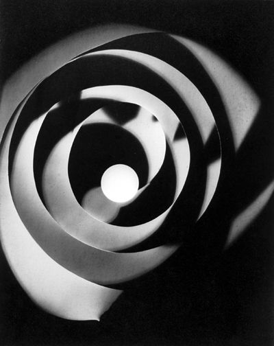
Man Ray (1890-1976) – This american was one of the founders of the Dada movement (anti-art, ilogical and absurd), alogside with Michael Duchamp. In 1921. In Paris he comes across surrealismo (wich had a strong influence on Freud psicoanalisis, has enphatised the role of the subconsciente in creative activities) and becomes influente in the movement. Man Ray developed lots of experimental works, in techniques such as: Sabatier efect, photograms, multiple exposures and original techniques in photosensitivity and photographic prints.
Man Ray – Rayographs, 1925
The process and evolution of photograms is fascinating and experimental, so is it’s own process. Despite the interest, more than everything, the history just made me very curious on how to actually make a photogram or a sun print. Because, the concept seems rather simple, but the time that took for it to develop must require some skills wich i do not, yet, have.
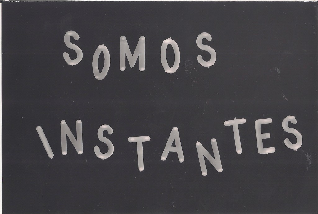
My name is Ana, I’m 26y and counting, Portuguese, from a small town and currently studying photography at ETIC in Lisbon. I actually work as a nurse but my passion is photography, which i didn’t pursue earlier because i cracked under parental pressure. But here i am today, with their support.
I’m here writing you today, not beacause I am any good at this but for academic purpose. Meaning: i was asked to start a blog in Printmaking class so i could share my lab experiences, new found knowledge and make it into a sort of personal journal.
Therefore this blog is not meant to be pretencious or formal.
Other things you should know:
I know absolutely nothing about blogging so, this should at least be fun (although sometimes confusing).
If anything I hope someone will read this and learn smething, has i did.
So, i will write about photography, it’s history, printnaking (regular and alternative processes) and my personal experience.
I hope you enjoy my crazy ride and my ideas. If not, well teach me how to be better.
P.S. very glad this was a short post, i cannot promise you the same about all the others to come.